


Escofet 1886
Editorial design

This was our challenge, to present a product for this group so they could use it for their projects, but also to show them how Escofet could become their strategic partner. Any product without an associated project equals nothing. Escofet felt their potential clients weren’t aware of this fact, and using the catalogue as an excuse gave us the opportunity to explain ourselves and adjust their positioning.
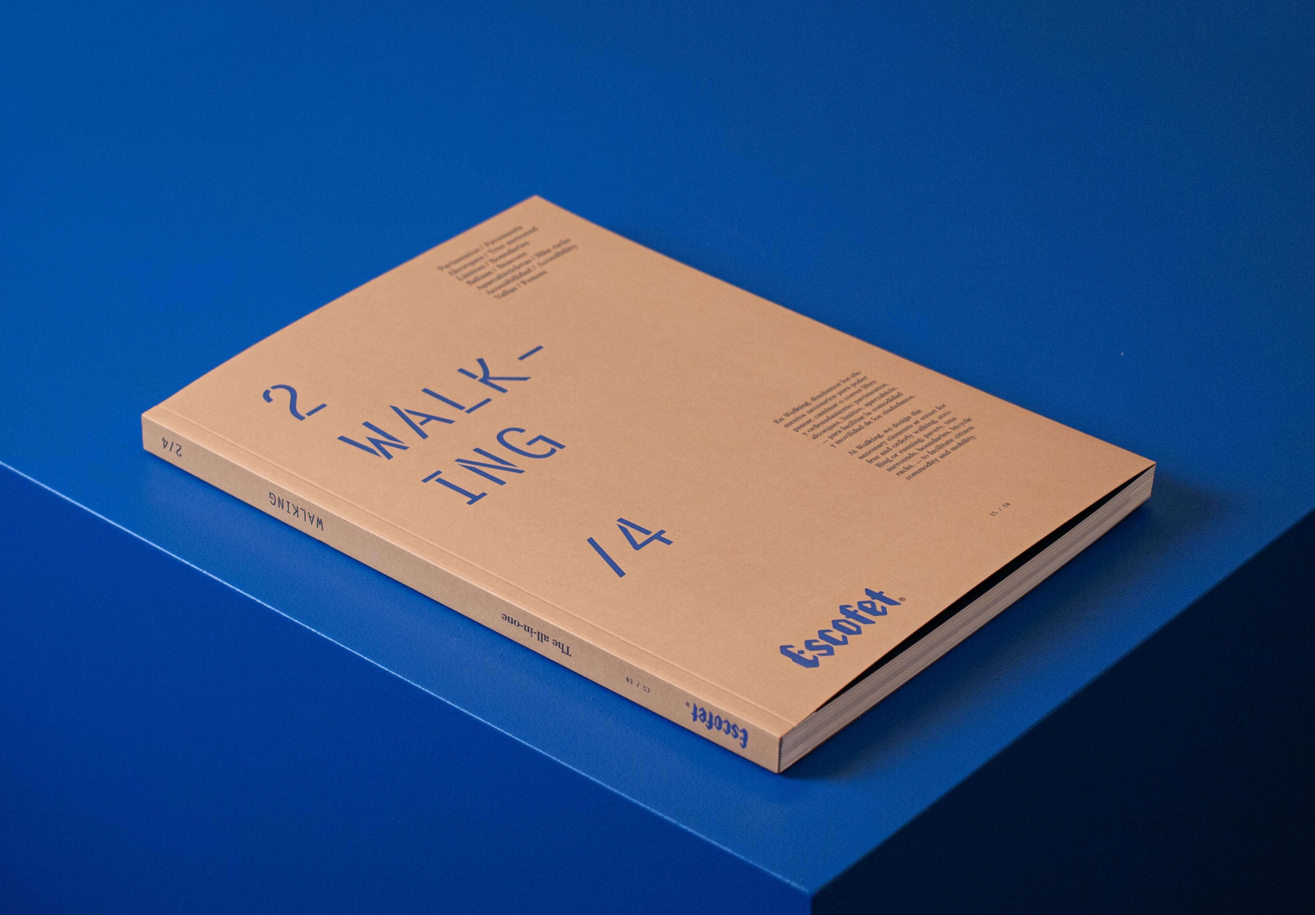
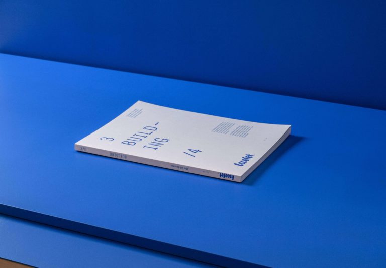
Escofet’s wide range of products meant creating a new discourse to clarify and make the offer more comprehensible to their clients and/or future clients. 4 business lines were created, each of them with an independent volume but all of them part of a whole. What should have been a single catalogue became a collection of 4 volumes under the same concept: The all-in-one.


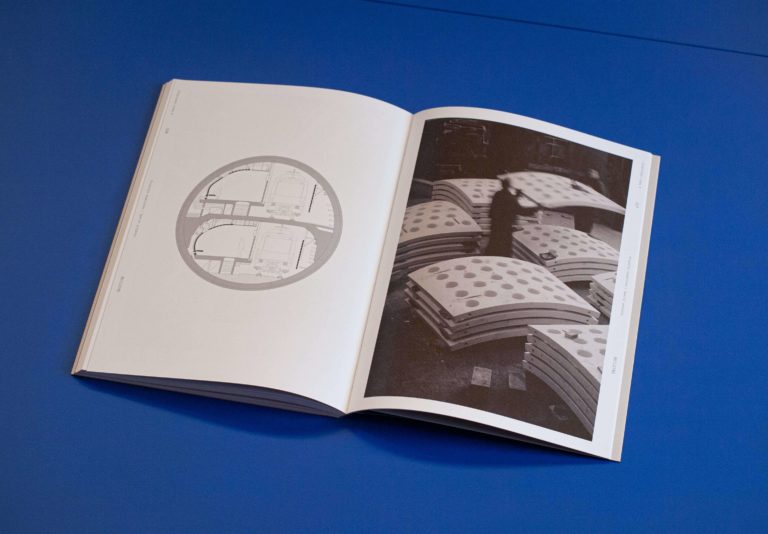
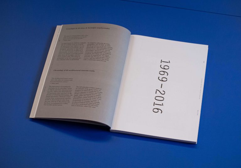
This new categorization showed more than 130 years of history and a double course of action between technology and profession. The big novelty was one of their copies, Buildings, the branch which collaborates side by side with architects in order to project and build façades as singular as the one in Sagrada Familia, World Trade Centre or Palau Sant Jordi, all in Barcelona.


This collection is a declaration of intent in itself. An exercise which consolidates the brand’s own language. On one hand, using a closed A4 – open A3 format (great for our prescribers). On the other hand, using 3 different typographies: a monospace for the most rational part of the content, for descriptions and characteristics; a serif which provides the culture component and helps us highlight and create more literary texts, those above the descriptive, the technical or the literal ones; and their own typography providing voice, expression and distinction to the brand.
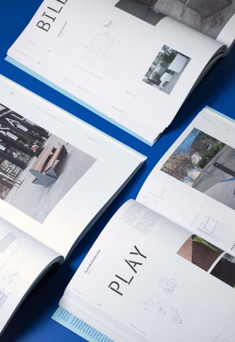
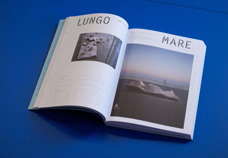
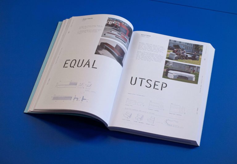
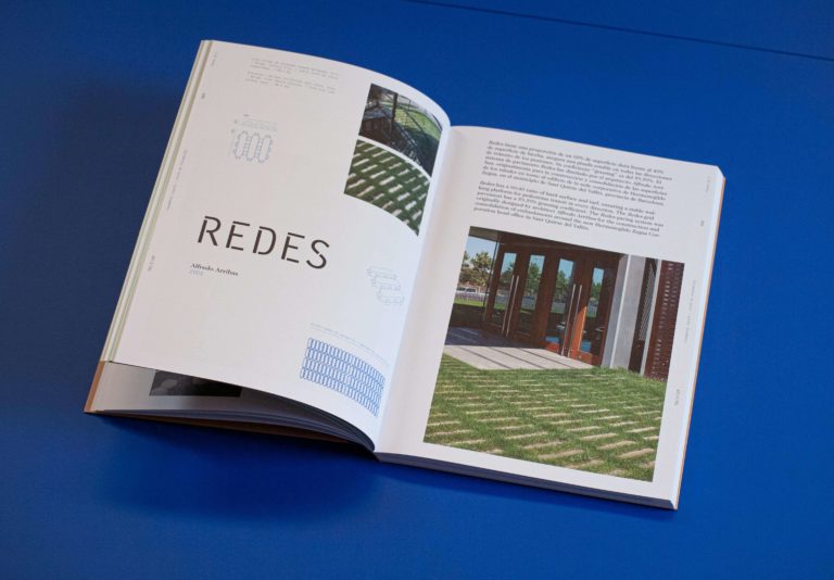
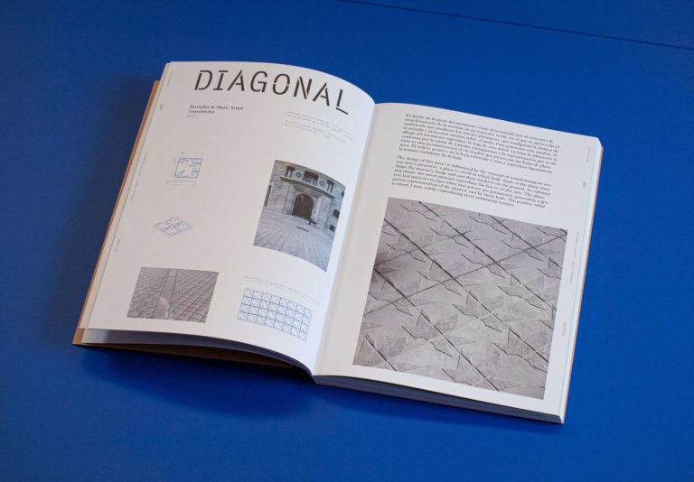
A new stencil version for the Letter gothic used historically by the company allowed us to logotype more than 200 products in a unique way and helped us create rhythm in between pages. This is reason why the product’s name acquires, in this edition, a graphic parallel importance. These names, with great narrative value, contain the product’s soul and become a tribute to the author’s effort to define the identity of the product.


Each product/project, just like its name, is unique and unrepeatable, and so are the pages dedicated to them in the different volumes of the collection. The content and personality of the product predominate the space transforming each double page into something unique, providing rhythm and interest to the consultation.
Benches
Chairs
Tables
Planters
Fountains
Litter bins


Pavements
Tree grids
Limits
Beacons
Bicycle parking
Access
Fences


Facades
Lattices
Special projects


Catalogue collection The all-in-one
Client: Escofet 1886
Year: 2016-2017
Editing direction: Enric Pericas
Coordination: Gerard Arqué
Concept & editorial design: Xavier M
Text: Guim Espelt, Omar Ornaque
Translation: Jamie Benyei, Siens Translating
Printing: Gràfiques Cirera S.L & Norprint S.L.
